PolarPod
A storefront designed for a portable ice bath brand, from user research and information architecture through to wireframes and hi-fi screens.
What they came with
A portable ice bath is bought by people who have heard cold therapy is good for them and have no idea where to start. The brand's difficulty was not the product: it was that the benefits went unexplained, the specifications were hard to compare, and there was nothing on the page to make a first-time buyer believe the claims. People arrived curious and left without choosing.
What the build had to do
Three audiences, one page order
Athletes want recovery evidence and specifications, wellness seekers want the mental health case, and outdoor users want portability. Those three readings had to share one landing page, which decides what the hero claims and what each section below it is allowed to argue.
Research before a single screen
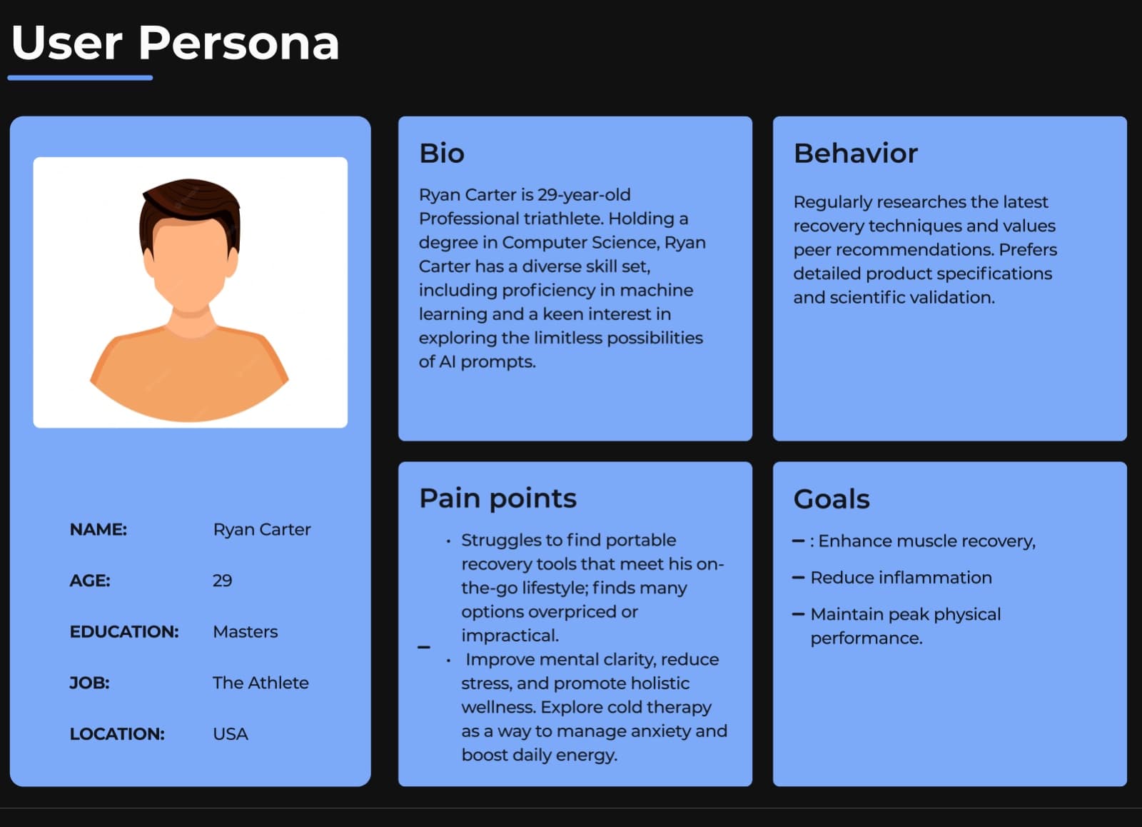
Interviews, competitive analysis, an empathy map and a persona came first, and they set the brief: buyers who had heard of cold therapy but did not know where to start, were unsure what to buy, and did not trust the claims.
An architecture with the decision in it
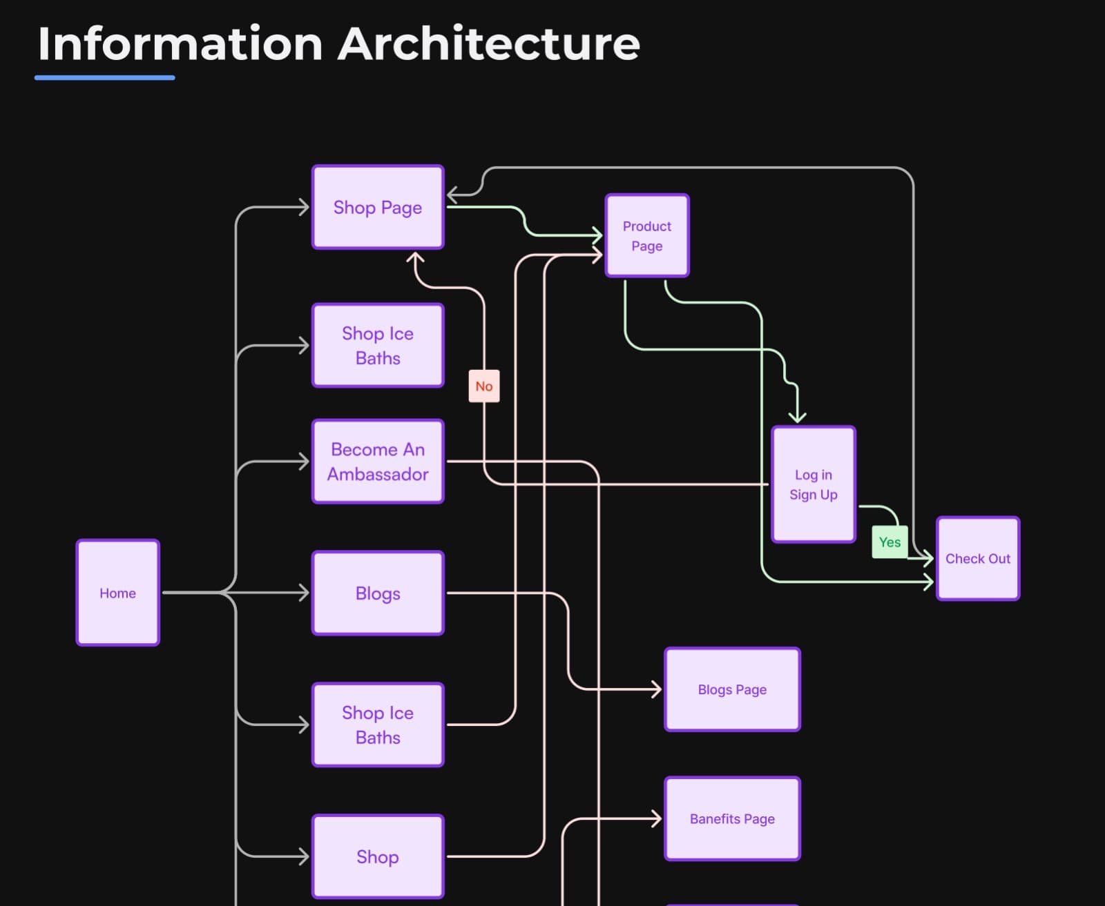
The flow maps home, shop, product, blogs and the ambassador route, and marks the point where a buyer either signs in or carries on to checkout. Drawing that branch in the architecture is what stops an account wall appearing in the middle of a purchase.
Education carried as merchandising
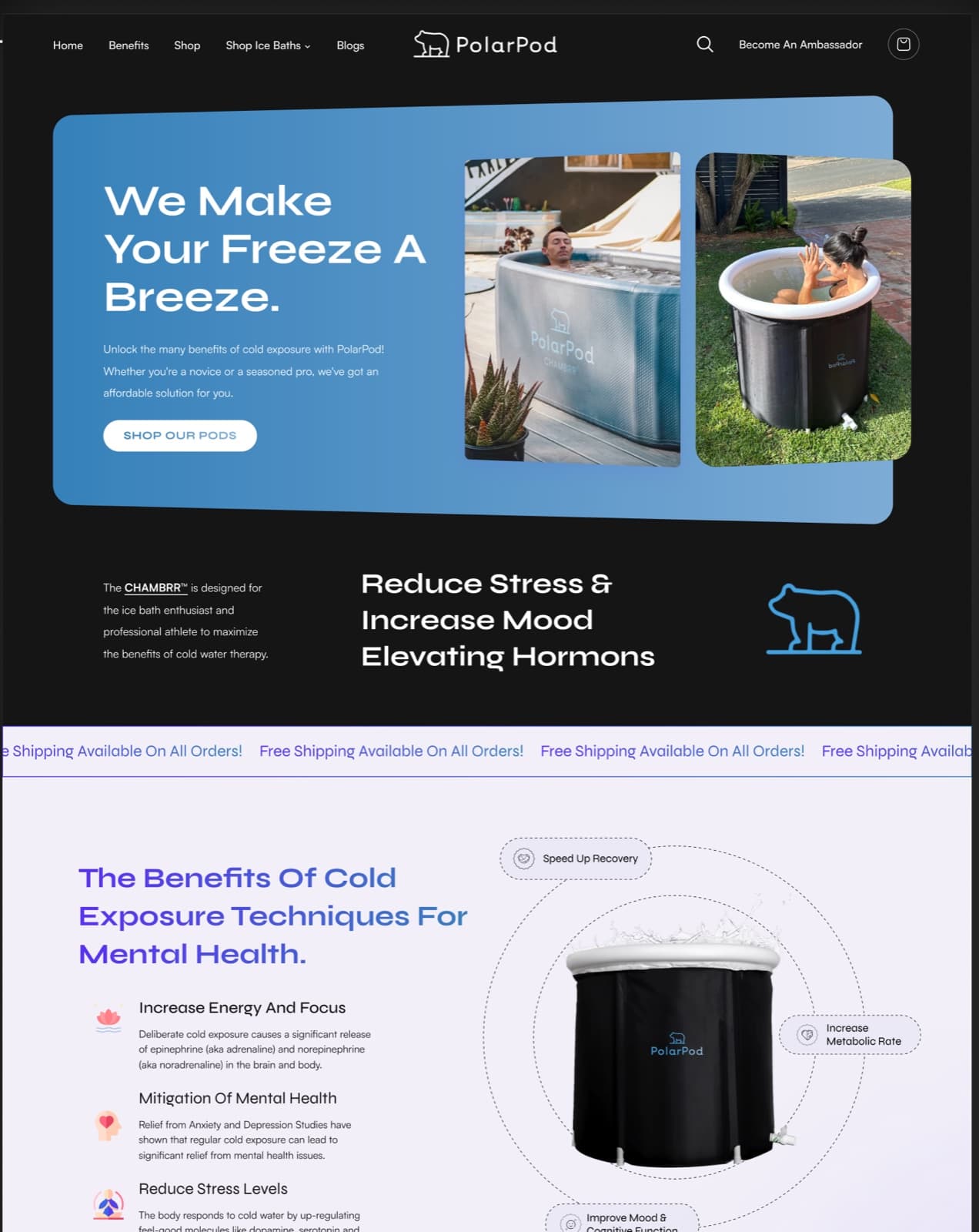
The benefits of cold exposure are laid out as a section of the storefront rather than a blog nobody reaches: energy and focus, mental health, stress, with the mechanism stated plainly beside the product that delivers it.
Trust placed where the doubt is
Reviews, partner logos and the shipping promise sit at the points the research showed people hesitate: after the price, and before the add to cart.
Wireframes first, then the finish
Structure was settled in grey boxes before any colour, so the hi-fi pass could spend its time on typography, photography and motion rather than re-arguing what goes where.
Technical detail
A five-stage process on a fixed clock
Understand, define, ideate, design and test, budgeted at two, one, two, five and three days. Naming the stages and their length is what keeps a design engagement from spending its whole budget on exploration and arriving at hi-fi with no time to test it.
The guest path stays open
The architecture routes product to checkout directly and treats sign-in as a branch rather than a gate, so an account is something a buyer can choose rather than a wall between them and the purchase. That decision is made in the flow diagram, before any screen exists to argue about.
Structure fixed in grey
Wireframes settle the order of sections, the shape of the product card and where the calls to action sit, so the hi-fi pass is a question of type, imagery and motion rather than layout. Changes are cheap in grey boxes and expensive in a finished comp.
One component set across the pages
The product card, the benefit block, the review strip and the banner are drawn once and reused across landing, shop, product and blog, so the design hands over as a set of components a developer can build rather than as five unrelated pages.
The stack
Design
Research
Deliverables
- Sector
- Recovery and wellness, direct to consumer
- Audience
- Athletes, wellness seekers, outdoor users
- Shape
- Research, IA, storefront design
- Tools
- Figma, FigJam, Photoshop


Something like this to build?
Tell us what runs today and where it hurts. An engineer reads it and replies.