Nocturne
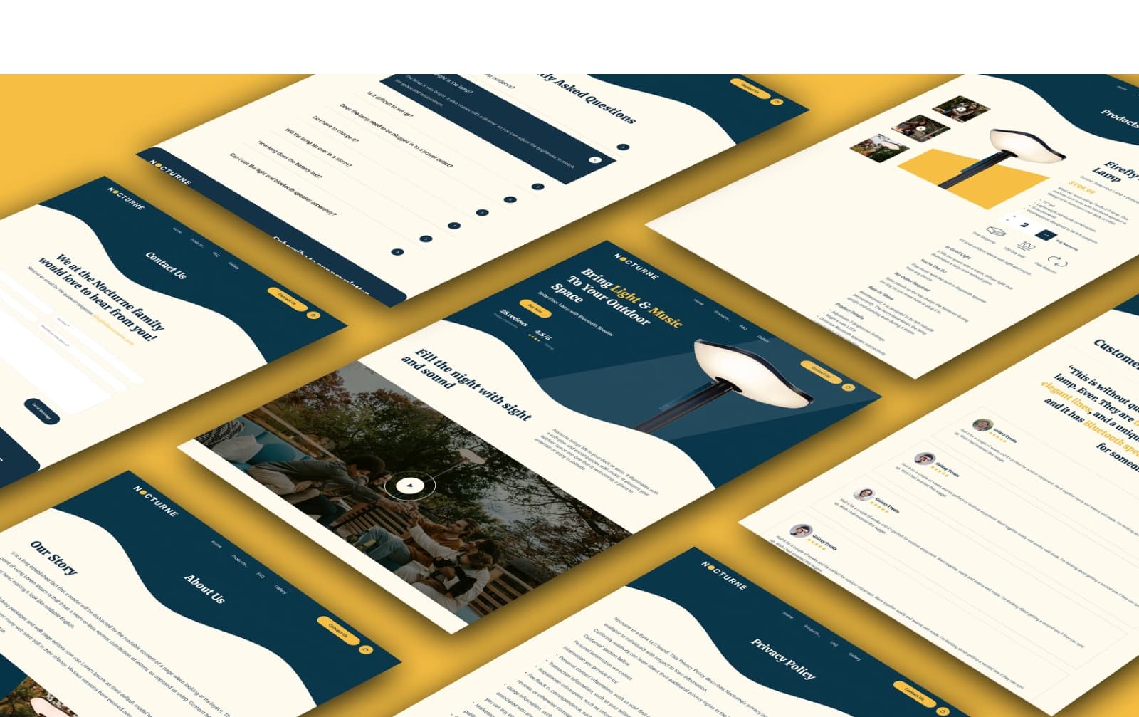
A redesign for a solar floor lamp with a built-in speaker: research, a defined problem, an architecture and a full storefront design.
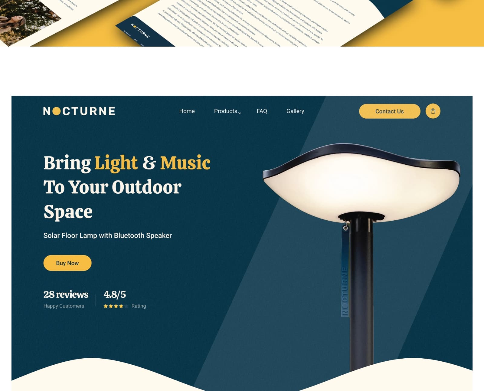
What they came with
A solar lamp that also plays music is an easy thing to like and a hard thing to sell from a page. The site it had could describe the product but not make the case for it: the solar, the speaker and the weatherproofing were listed rather than argued, the sections that answer doubt were hard to find, and people who arrived interested left without buying. The research put numbers on it, and the numbers were about the page rather than the lamp.
What the build had to do
Research before the redesign
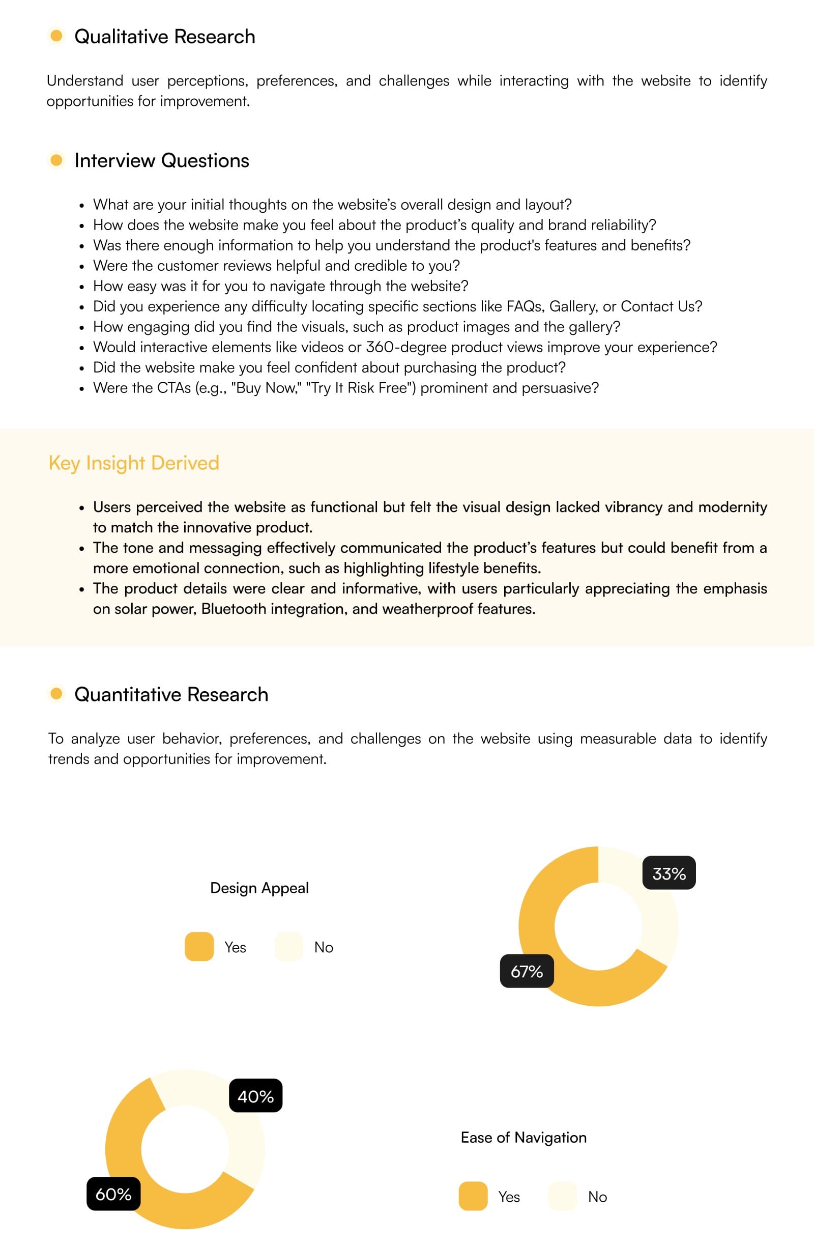
Interviews and a survey came first, and both were reported: design appeal, ease of navigation, trust, engagement and conversion each carried a yes and no split. The redesign then had to answer the specific readings rather than a general sense that the site looked dated.
A product that needs explaining
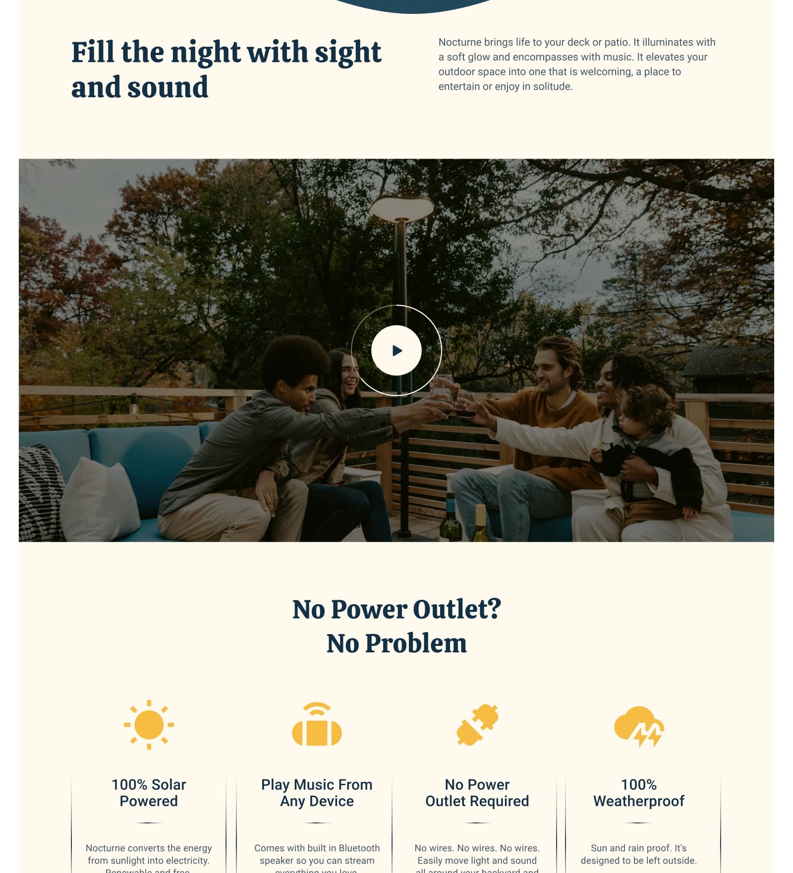
One lamp does three things at once: it runs on solar, it plays music over Bluetooth, and it survives weather. Each of those is a reason to buy for a different person, so the page order had to introduce all three without turning into a specification sheet.
The sections people could not find
The research showed readers losing the FAQ and the gallery, and both are where doubt gets resolved on a product like this. They were pulled into the main navigation and given their own place in the page order rather than left in the footer.
Trust placed at the hesitation
Reviews, the rating, the thirty-day trial and the FAQ sit at the points the research showed people stalling: after the price, and before the buy. They are content, not badges, so each one has to be maintained rather than pasted on.
Two flows drawn separately
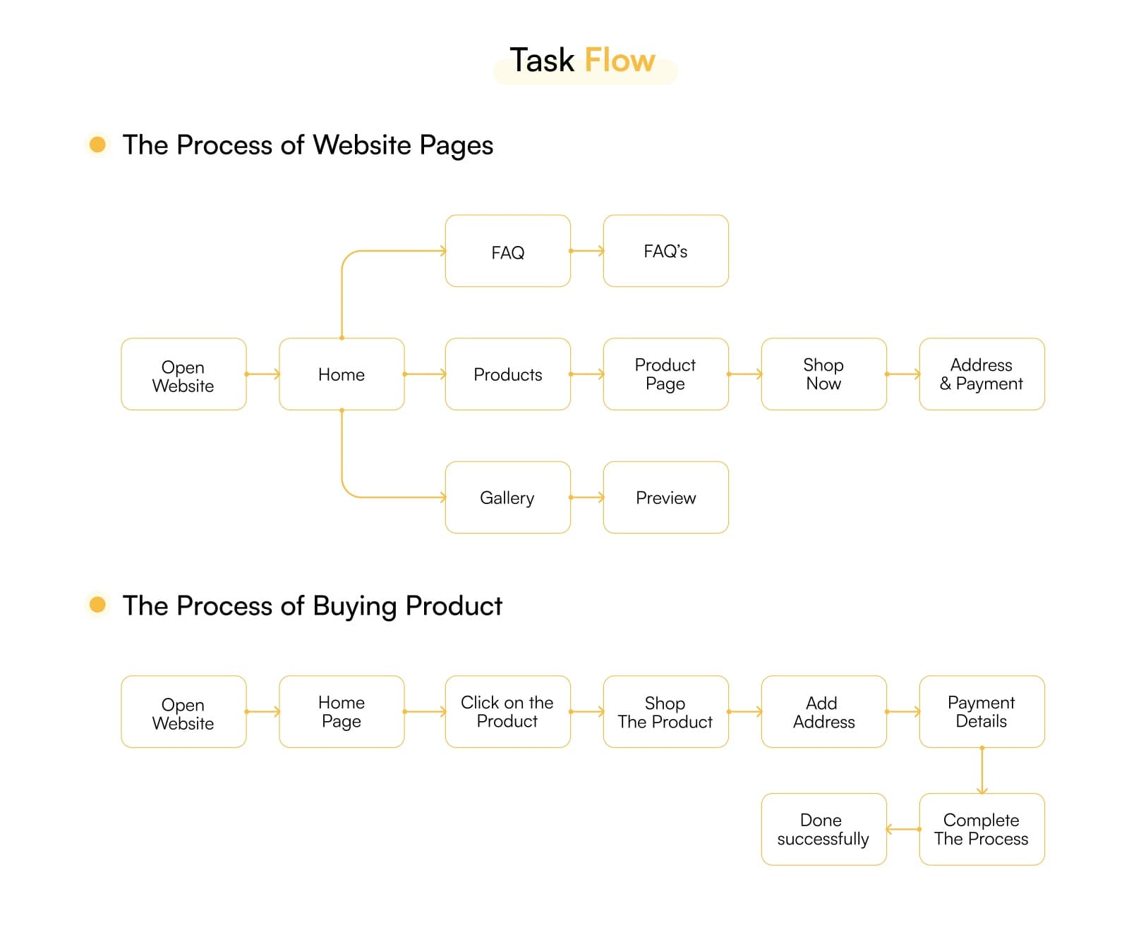
Browsing the site and buying the product were mapped as two task flows, so the pages a visitor wanders through and the six steps from product to confirmation could be designed without one compromising the other.
A type and colour system, not a palette
Calistoga for headlines, Roboto for text, and five named colours with their roles fixed. Writing them down as roles is what lets a developer build a page nobody has designed yet and still have it look like the same site.
Technical detail
The survey set the brief
Five measures were put to users as a yes or no — design appeal, ease of navigation, trust, engagement and conversion — and each came back with a split. Designing against five stated readings is a different exercise from redesigning on taste, because every later decision can be checked against the one it was meant to answer.
Two task flows, drawn apart
Browsing and buying were mapped as separate flows: one wanders home, products, gallery and FAQ, the other runs product, shop, address, payment, confirmation. Keeping them apart means the purchase path can be short without the rest of the site having to be.
A twelve-week plan with testing in it
Research, wireframes, usability testing, then visual design and prototyping, budgeted across twelve weeks. Putting the test phase before the visual design is what stops a beautiful comp being the first time anyone finds out the navigation does not work.
Tokens rather than a style sheet
Two typefaces with defined roles and five colours named by function — primary, secondary, two text weights, background — so the design hands over as a system a developer can extend to pages that were never drawn.
The stack
Design
Research
Deliverables
- Sector
- Solar lighting, direct to consumer
- Audience
- Homeowners, hosts, outdoor buyers
- Shape
- Research, IA, storefront redesign
- Tools
- Figma, FigJam
Something like this to build?
Tell us what runs today and where it hurts. An engineer reads it and replies.