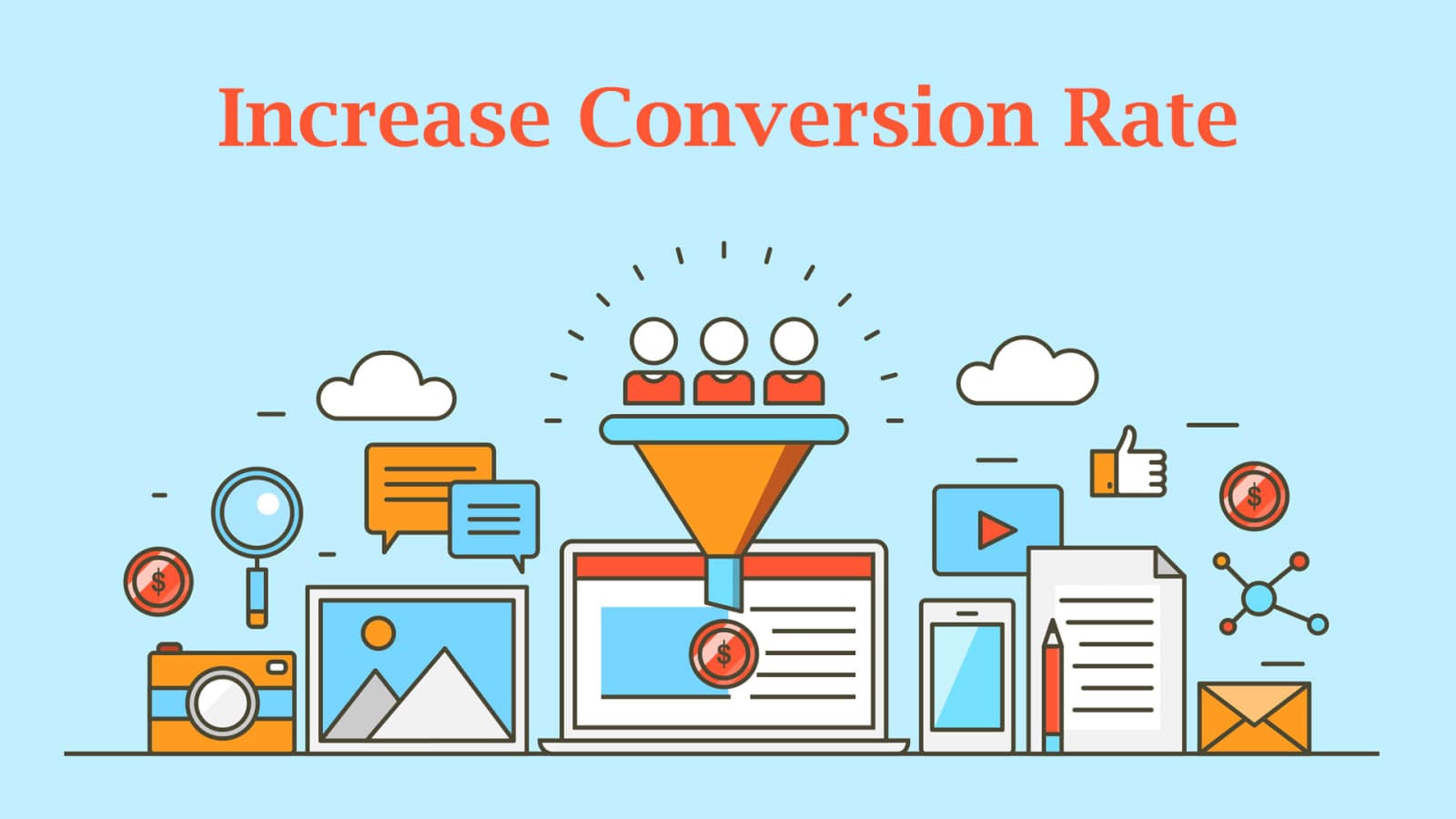
Every e-commerce team watches the same number. It is the share of visitors who leave with an order, and it sits directly on top of revenue. That is why so much effort goes into moving it, and why a good deal of that effort lands somewhere other than the place the orders are actually being lost. The movement rarely comes from one change, though. It comes from the layout, the product copy, the buttons, the proof on the page, the checkout, and the patience to keep testing all of them.
What follows are the strategies that tend to earn their keep on an online store, roughly in the order a shopper meets them.
A store people can move through without thinking
Navigation is the first thing a visitor tests, usually within a second or two of arriving and usually without noticing they are testing anything at all. Categories should be named the way customers describe products rather than the way the catalogue happens to be organized internally. Search has to work, including for misspellings, plurals and the half-remembered product names people type when the exact one will not come to them. Pages have to load quickly, and on a phone they have to load faster than that. Forms should ask for the minimum. None of this is glamorous. All of it shows up in the conversion rate, because a shopper who cannot find a product cannot buy it.
Product copy that answers the buying question
A product description has one job: to give someone enough to decide. Lead with what the product does for the buyer. Follow with the features that back that up, then the details a careful shopper goes looking for, such as materials, sizes, compatibility and what is included. Write plainly and specifically. Vague superlatives read as filler and get skipped. Where you have customer feedback that supports a claim, put it beside the claim instead of burying it at the bottom of the page where the shoppers who most needed to see it will never scroll.
Buttons that say what happens next
Call-to-action copy should leave no ambiguity about what a click does. “Buy Now,” “Sign Up” and “Get Started” work because they name the action and imply it happens immediately. Wording that hedges makes the visitor stop and think. A visitor who has stopped thinking about the product to think about the interface is one step further from buying.
Placement and contrast matter as much as the words. Pick a button color that separates from everything around it. Give the button enough size to register at a glance. Then put it where the decision actually gets made: high on the page for someone who already knows what they want, and again at the end of the description, once the shopper has read the case for the product. A button nobody notices converts nobody.
Let your customers vouch for you
Reviews do work your own copy cannot do. A shopper weighs a stranger's account of a product much the way they weigh a friend's recommendation, and honest feedback on the page answers a question your marketing cannot answer credibly on its own. Ask for reviews after purchase. Make leaving one take under a minute.
Then show them properly. Star ratings near the product title. An average rating visible before anyone has to scroll, a section with written testimonials, and photographs from customers where you have them. Specific reviews carry more weight than glowing ones. An account of what somebody actually used the product for tells the next buyer whether it fits their situation, and that is what stands between a browse and a purchase.
Pictures, video and the checkout at the end
Online, the images do the job the shelf does in a shop, which is to let somebody form a judgement before committing. Shoot the product from several angles, show scale, show detail, and let people zoom in. Video goes further. A short clip of the product in use answers questions a still image cannot: how it works, how big it really is, how it moves, how it might be worn or arranged. Both cut down the guesswork that makes shoppers hesitate at the last step, which is the only moment in the visit where hesitation is expensive.
That last step is where the most expensive losses happen. A long checkout loses orders you had already won, so cut the number of steps back to what taking payment genuinely requires and delete everything else. Offer guest checkout, because forcing account creation on somebody buying from you for the first time is an obstacle you invented yourself and can therefore remove. Support more than one payment method. Show progress so people know how much is left. Let them go back and change an address without starting over.
Carts still get abandoned. Automated reminder emails recover a share of them, particularly when they arrive while the purchase is still in mind. An incentive such as a discount or free shipping gives a hesitating shopper a reason to finish. A message that names the item left sitting in the cart does better than a generic nudge.
Handing over card details is where doubt turns up. Secure payment icons, a valid SSL certificate and recognized security badges tell a first-time buyer their information is being handled properly. So do the unglamorous pages. A privacy policy in plain language, a return policy written without weasel words, a visible way to reach a person. Trust costs little to signal and a great deal to lose.
Showing the right products to the right shopper
Personalization used to be a merge field in an email. Now the page itself changes. Recommendations drawn from browsing history and past purchases, homepage content that adapts for a returning visitor, offers triggered by behavior rather than by the calendar. Built on real data rather than on a marketer's guess about segments, it makes the store feel as though it was arranged for the one person looking at it.
Cross-selling and upselling belong in the same conversation. Related products on the product page, complementary items at checkout, the better version of what the shopper is already considering. Each one raises average order value. Each one also shortens the search for the next thing that customer needs, which is part of why stores that personalize well see the same people come back rather than starting from zero every quarter.
Testing, and what you do with the result
Most of the decisions above have more than one reasonable answer. The only way to settle them on your own traffic is to test. Run variations of headlines, button copy, layouts, colors and product images against each other, then let the numbers pick the winner. Keep the tests honest. One meaningful change at a time. Enough traffic for the result to mean something, and a decision made when the test finishes rather than when it first starts looking good.
Conversion rate optimization is the long-running version of that habit. Watch analytics for the step where visitors drop out. Sit with session recordings, or run a few usability sessions, until you understand why they are dropping out at that particular step. Fix the worst step, measure again, move on. Individually the gains are small. Compounded across a year of them, they change what the site earns.
None of this has to happen at once. Find the point in the funnel where you lose the most people, fix that, then go to the next one. The order matters less than keeping the loop running.
Villaex Technologies works with e-commerce teams on exactly this: user experience, persuasive product content, and the calls to action that carry a visitor through to checkout. If your store is leaking orders somewhere and the analytics have not told you where, our team is happy to take a look at it.
Building something like this?
Tell us what runs today and where it hurts. An engineer reads it and replies.