Skyllful
A marketing site for a mobile training platform, built for the IT, operations and training people who put new software in front of field teams.
What they came with
One product has to answer three different questions at once. An IT director planning a rollout, a training lead sitting on a pile of SOPs, and an operations manager watching error rates all arrive looking for different words, and they arrive by different routes: a software name like SAP or ServiceNow, an industry like route distribution, or a problem like safety refreshers. Behind that sit a resource library, a blog, a podcast, a glossary and named customer stories, all of which have to end at the same enquiry. Pricing is banded by workforce size rather than sold at one figure, so the pricing page has to compute rather than list.
What the build had to do
Navigation on three axes
The mega-menu cuts the same product by use case, by industry and by the software a team already runs, with the resource estate hanging off a fourth column. The hard part is that one page has to be reachable and correctly framed from all three taxonomies without duplicating it.
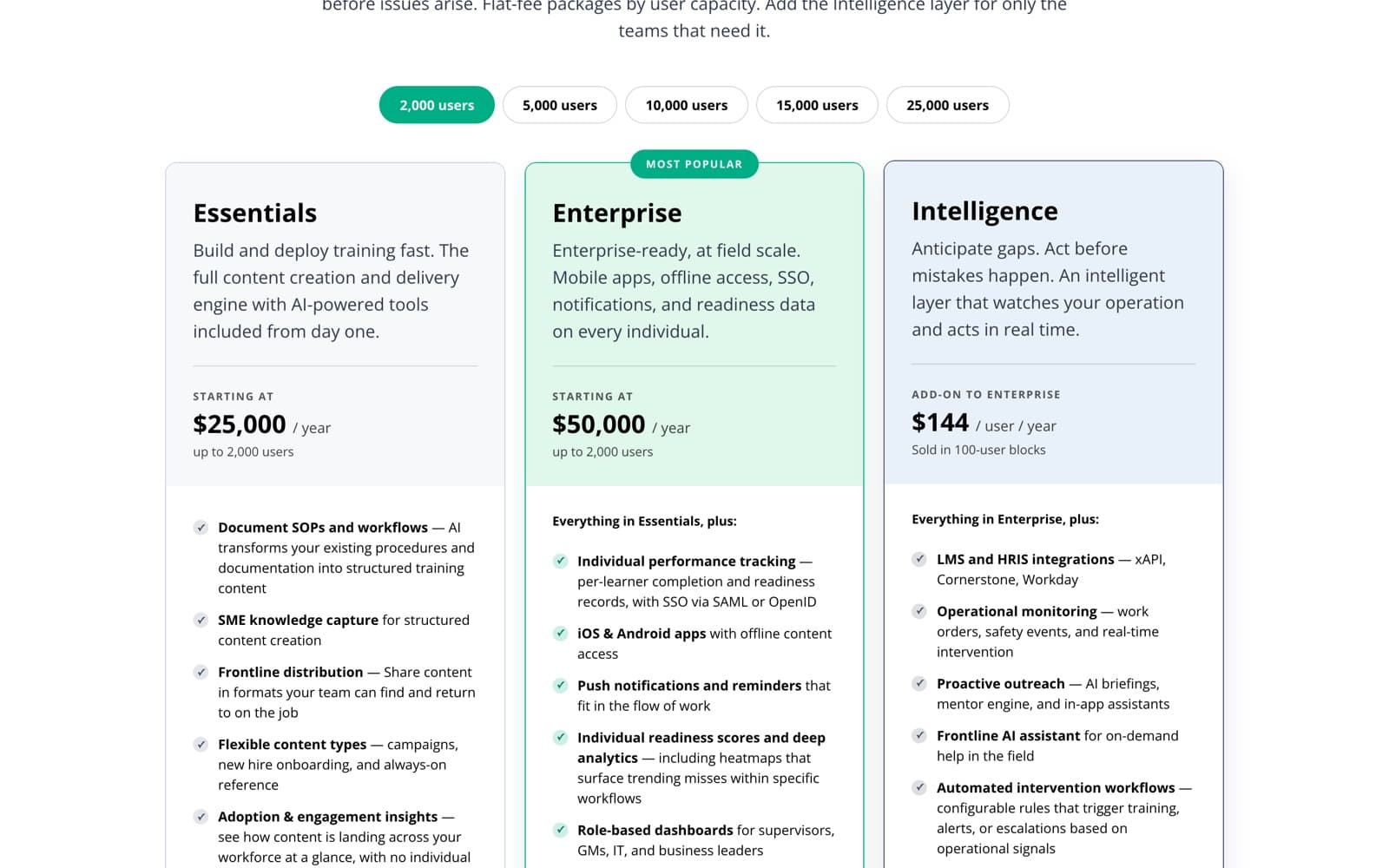
A pricing table that reprices
Five capacity bands run from 2,000 to 25,000 users above two flat-fee tiers, a per-user add-on sold in blocks, and a custom option. Selecting a band rewrites the figures and the user caps in place, so the tier copy and the price data have to be modelled apart from each other rather than written into the cards.
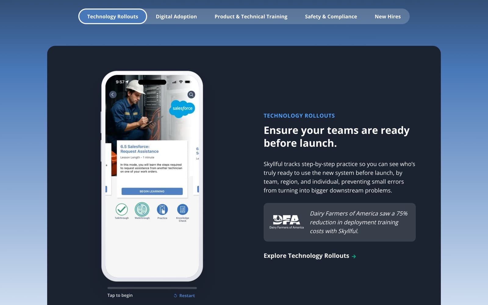
Use-case tabs with a device demo
A tab rail switches five operational problems, and each panel pairs its copy and its customer proof with a phone frame the visitor can tap through and restart. Tab state, body copy, the proof block and the demo all have to change together and stay in step when someone tabs quickly.
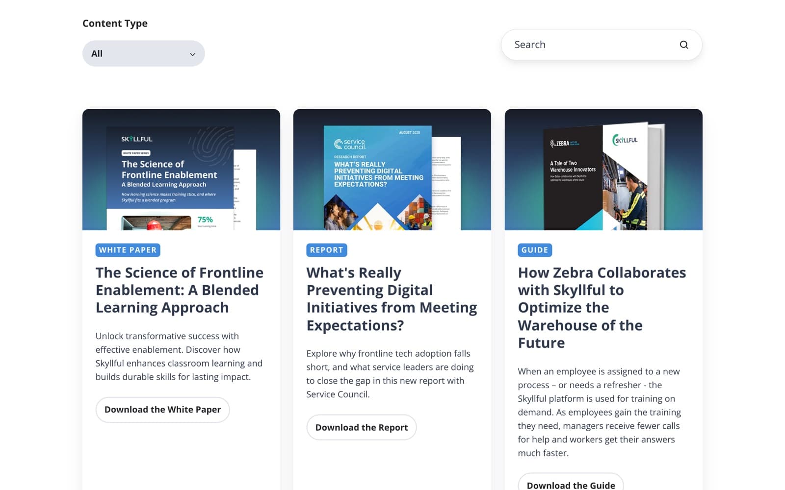
Resource library filtered by type
Cards carry a content-type chip across seven types, from checklist to white paper, and a filter narrows the grid in place. Each asset also has a page of its own, so the card, the filter value and the destination are three faces of one record.
One customer story, three renderings
The same five customer stories appear as a switchable tab set on the home page, again on the platform page under a different heading, and again as full pages. Authoring them once and rendering them three ways is what keeps the set from drifting.
Technical detail
Sections as typed modules
Rather than dropping rich text into flexible columns, the theme ships each section as its own module with named fields, so an editor changes values and the layout cannot come apart. The trade is that a genuinely new section is a module build and a deploy, not a page edit, which is the right way round for a site this many people touch.
Per-module CSS, and JS at the point of use
Each module brings its own minified stylesheet into the document head and its own script down in the body, so a page carries only the interaction code it uses and an unrelated page never pays for the tab player. The theme's own stylesheets are pushed earlier still, in an HTTP 103 Early Hints response ahead of the document. The cost is a long head on the busiest pages, which makes load order a decision rather than a default.
The demo is a page inside a page
Each use-case tab embeds a standalone HTML file from the file manager in a fixed 370 by 725 iframe with scrolling off. Those files carry their own fonts, their own inlined artwork and their own restart control, and load no external script, so a simulator can be rebuilt without touching the site. The tab module also pins scroll position on click, which is what stops the page jumping when a panel of a different height takes over.
The stack
Platform
Front end
Delivery
Measurement
- Sector
- B2B software, frontline training
- Audience
- IT, operations, training leads
- Shape
- Marketing site, library, pricing
- Platform
- HubSpot CMS, custom theme
Something like this to build?
Tell us what runs today and where it hurts. An engineer reads it and replies.